How does understanding the stock market help students make better financial decisions?
Grades 9 - 12
Grasping financial literacy through stocks from a young age establishes a foundation for long-term financial literacy, encouraging students to make informed decisions, develop saving habits, and leverage the compounding benefits of early investments.
In this data visualization, our goal is to introduce the concept of stocks, highlighting the advantages of cultivating a positive mentality and mindset towards investing.
To answer our question we used data from:
Yfinance is a Python library which helps to download market data using Yahoo!’s finance API. With this library, we can freely find historical data about stocks in the stock market.
Visualizing the data
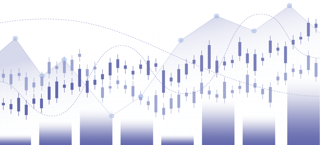
Initially, we explored the opening and closing price history of the S&P 500 Index — a collection of 500 of the biggest companies in the United States, chosen to show how well the stock market is doing overall. It helps investors understand if the stock market is going up or down.
The trend line doesn’t show a significant increase until approximately 1990. Following this period, we observe a gradual uptick in stock prices, punctuated by periods of substantial growth (such as in the 2010s) and stagnation (as seen in the 2000s). However, the overall trend indicates an upward trajectory, despite periods of sudden growth and decline. This analysis served as a good benchmark to demonstrate how investing in a safe group of stocks like an ETF can lead to long-term growth and financial sustainability.
Afterwards, we implemented the ability for users to research the historical price of different stocks on the Nasdaq, leading to informative insights such as which stocks historically perform better during particular periods and analyzing patterns of when prices generally will rise or fall.
In this particular example, we can see Apple’s historical stock prices from 2000 to 2023. Apple’s peak stock price was around 2021 to 2022, and throughout Apple’s history, its stock price has generally shown a slow increase, starting from approximately 2010 onwards.
Reflect on what you see
Look and interact with the data visualization above. When you hover the mouse over the bar graph, you’ll notice more information appears.
Think about the following questions.
- What do you notice about the visualizations?
- What do you wonder about the data?
Use the fill-in-the-blank prompts to summarize your thoughts.
- “I used to think _______”
- “Now I think _______”
- “I wish I knew more about _______”
- “These data visualizations remind me of _______”
- "I really like _______”
Learn how we visualized the data
Go to our walk-through and Machine Learning notebook walk-through (in Jupyter notebook format) to see how the data science process was applied to create these graphs, from formulating a question to gathering the data and analyzing the data with code.