Where does Canada's money flow?
Grades 6 - 9
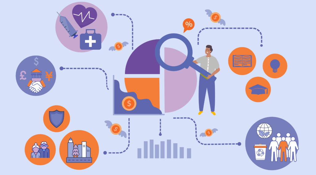
Understanding the Canadian government's budget, expenditures, and future spending plans is important for promoting transparency and accountability. Moreover, it allows us to pinpoint areas for optimization, focusing on high-spending sectors.
In this data visualization, we examined how various sectors within the Canadian government allocate their budgets. By identifying the highest and lowest spenders, we seek to understand the distribution of expenses and discover trends in budget allocation for crucial categories like health and defense.
To answer our question we used data from:
Visualizing the data
First, we created a stacked bar graph representing the general progression of government expenses between 2008 and 2021.
Analyzing the visualization provides valuable insights into the government's priorities. Categories like Social Protection and Health consistently stand out as top priorities, showing minimal fluctuations over the years. This pattern extends to other categories, indicating relatively stable trends. Yet, it's essential to note that even seemingly small changes can have significant impacts when viewed on a larger financial scale.
We can also visualize the changes in expense allocations for each category individually. The visualization below shows these changes, with green categories having increased in budget allocations and red categories having decreased in budget allocations.
Half the categories saw a decrease in percentage, while the other half increased from 2008 to 2021. Notably, the largest jump occurred in 2019-2020, with a 7% increase in social protection, likely due to the onset of Covid-19. Interestingly, health, typically a priority in crises, saw a decrease.
Next, we used a Folium map to show the spending allocations of each province. In the following interactive visualization, you can navigate to the top tab labelled “Column”, choose the specific category of interest, and see the colours on the map. For each category, deeper shades of green indicate a higher allocation of government budget, while lighter hues suggest a comparatively lower allocation.
Reflect on what you see
Look and interact with the data visualization above. When you hover the mouse over the bar graph, you’ll notice more information appears.
Think about the following questions.
- What do you notice about the visualizations?
- What do you wonder about the data?
Use the fill-in-the-blank prompts to summarize your thoughts.
- “I used to think _______”
- “Now I think _______”
- “I wish I knew more about _______”
- “These data visualizations remind me of _______”
- "I really like _______”
Learn how we visualized the data
Go to our walk-through (in Jupyter notebook format) to see how the data science process was applied to create these graphs, from formulating a question to gathering the data and analyzing the data with code.