
What are the average blood pressure and heart rate in humans?
Grades 9 - 12
According to the World Health Organization (WHO), cardiovascular diseases (CVDs) are the leading cause of death worldwide. In 2019, CVDs were responsible for 32% of all global deaths, with the majority of those (85%) being from a heart attack or stroke.
Two major indicators of cardiovascular health are blood pressure and heart rate. In this exercise, we determine what the average blood pressure/ heart rate is in humans. We also explore if the sex of a person has any effect on these measurements.
To answer our question we:
- Used blood pressure and heart rate data from the National Health and Nutrition Examination Survey (NHANES)
- Used demographics data from the National Health and Nutrition Examination Survey (NHANES)
- Created a series of histogram graphs
What is blood pressure?
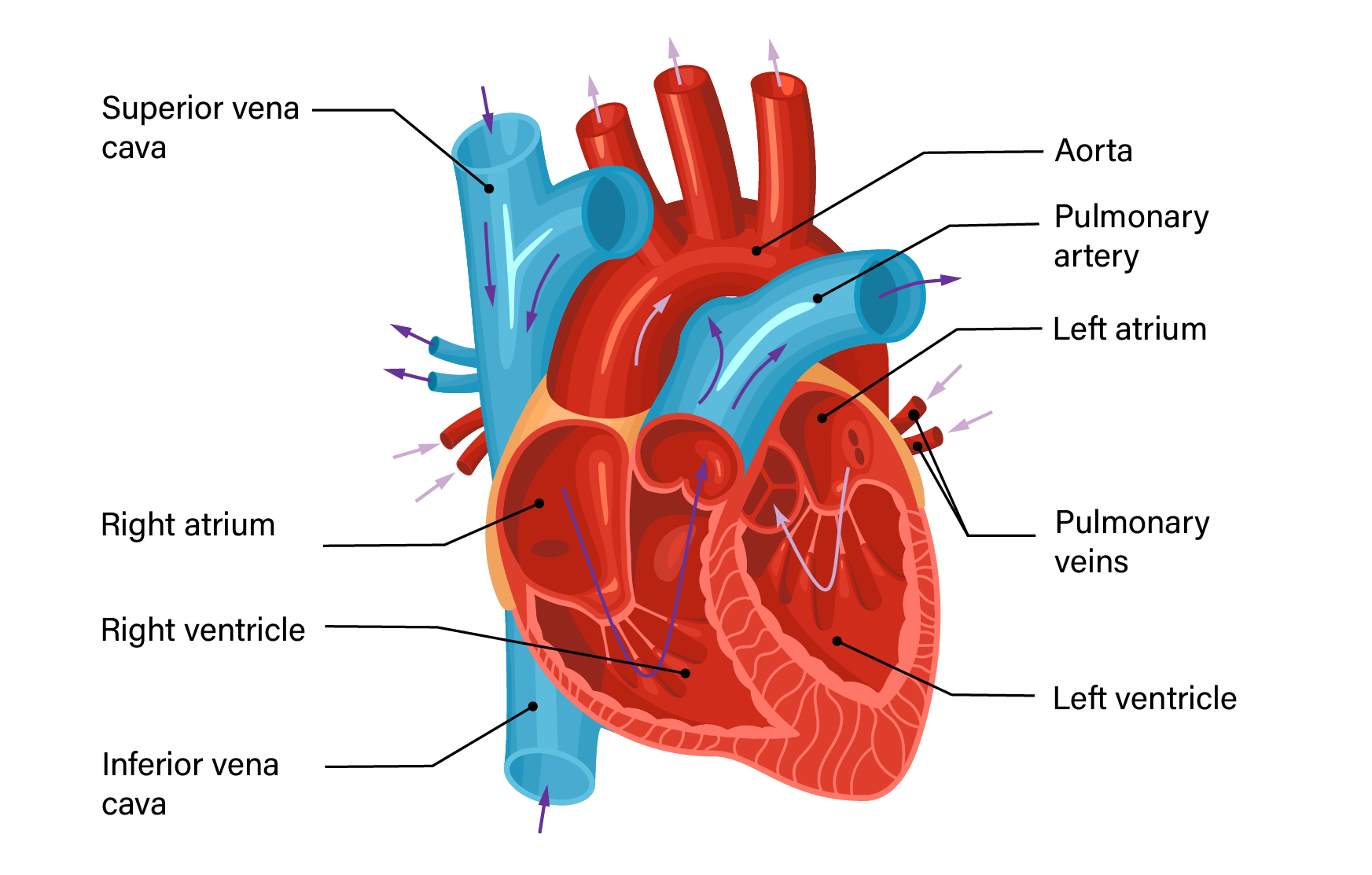
Measurements of blood pressure (BP) consist of two readings: systolic BP and diastolic BP. Systolic BP is the pressure exerted by the heart on the arteries as it contracts and forces blood out of the left ventricle into the aorta. A typical healthy systolic BP in adults is around 120 mmHg, though it's not uncommon to have lower blood pressure in active adults and children. This number can change quickly and frequently, often as a response to both negative stressors on the body — such as emotional distress and illness — or as a natural response to healthy states, such as exercise and sleep. A higher resting systolic BP value generally points to health complications.
Diastolic BP represents the pressure in the arteries when the heart is resting between beats. A healthy diastolic BP is around 80 mmHg. Similar to systolic BP, it's not unusual to have lower values of diastolic BP. As this measurement tends to be more stable, seeing higher values of diastolic BP is more concerning than higher values of systolic BP.
A measurement of 120 systolic and 80- diastolic BP is usually recorded as 120/80 mmHg, where the units are in millimetres of mercury (mmHg).
What is heart rate?
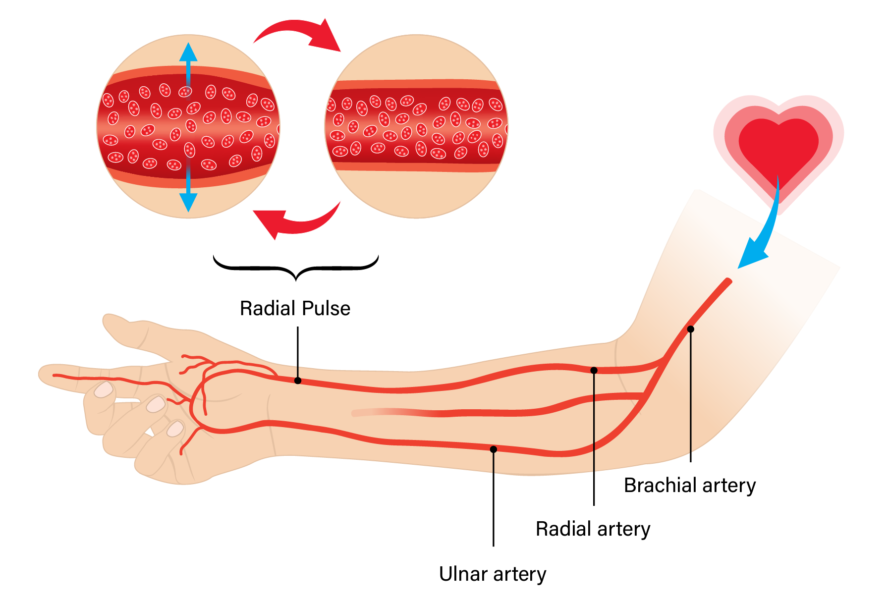
Heart rate (HR) is one of the simplest measurements of cardiovascular function. Multiple locations on the body can be used to measure HR, but the easiest is the radial artery in the wrist.
An easy way to measure the radial pulse is by placing the tip of the index and third fingers of one hand on the thumb side of the other forearm where we normally wear a wristwatch. With enough pressure, it is possible to feel each beat. By counting the number of beats for 15 seconds, and multiplying that number by four, we can measure our heart rate in beats per minute (bpm).
A typical (resting) heart rate in adults is between 60-72 bpm (up to 100 bpm in children), though extremely fit individuals can have a much lower heart rate. Heart rates can be elevated by the same stressors as blood pressure (exercise, emotional state), and drop considerably during sleep.
Visualizing the data
To investigate the average blood pressure, we first plotted the systolic BP readings from the NHANES data. In this interactive plot (below), you can see graphs from three independent readings (blue, red, and green) for the systolic BP from over 11,000 participants. We also plotted the averages of the three different readings for each participant in light purple.
In the plot above, we notice a significant overlap between the three readings, which means they follow similar distributions. Consequently, the plot of the averages over three readings also follows a similar distribution. Normal systolic BP in adults is less than 120 mmHg, and 58% of all participants had BP within the normal range. A value higher than 120 mmHg is considered high.
Second, we plotted three readings of diastolic blood pressures from the same participants.
In the plot above, we notice that most of the participants (~ 78%) have diastolic blood pressure within the normal range (< 80 mmHg).
When the resting value for the systolic blood pressure is above 135 mmHg, or the diastolic blood pressure is above 85 mmHg, it indicates the presence of a condition called hypertension. This can put one at risk of several serious health problems, including heart attack and stroke.
Finally, we plotted heart rates from three independent readings from the participants. The typical resting heart rate for an adolescent can be anywhere between 60 and 100 bpm, as shown by the transparent gray rectangle.
As you can see from the plots above, blood pressure and heart rate data follow a "normal" distribution, where it is bell-shaped and symmetric around the mean. The vast majority of participants have measurements clustered around the mean of all measurements. The number of people with BP values higher or lower than the mean quickly drops off as you go further from the mean. There are significant outliers in both directions, but that's an inevitability in any biological dataset.
What do you notice in this data visualization? Is there a noticeable difference between the three measurements of blood pressure? Why might that exist (or not exist)? Given the shape of the histogram, would you say most participants in this dataset have healthy blood pressure? Do the subsequent measurements of heart rate differ? Why or why not?
Reflect on what you see
Look and interact with the data visualizations above. When you hover your mouse over the plots, you’ll notice that more information appears. You can also use the legend to make plots appear and disappear.
Think about the following questions.
- What do you notice about these graphs?
- What do you wonder about the data?
Use the fill-in-the-blank prompts to summarize your thoughts.
- “I used to think _______”
- “Now I think _______”
- “I wish I knew more about _______”
- “These data visualizations remind me of _______”
- "I really like _______”
Learn how we visualized the data
Go to our walk-through (in Jupyter notebook format) to see how the data science process was applied to create these graphs, from formulating a question, to gathering the data, and analyzing the data with code.
In the Jupyter notebook, you can enter your own heart rate to see how your resting and elevated heart rates compare to the data. Can you think of any reason why they might not fall in the center of the plot?
Perform a quick exercise for 30 seconds or so, like jumping jacks or pushups and answer these questions: How does exercise change your heart rate? Is it still within the normal range?